Monday, November 29, 2010

... and that's a wrap

The Christmas cards are done for this year. Well, maybe. I bought a new stamp on the weekend, and it may have to be used. I also got a new House Mouse stamp. Colouring fun in my future, I think. 

Here's the last (I think) of the Christmas cards. 

 I bought this paper in the States- Love it- it's gold lettering on a kraft background. I stamped Dasher (Stampin Up) on kraft paper in brown. The sentiment is also Stampin Up.
 This paper was also a US purchase. There were 12 different old fashioned Santas on the page. I cut each one out, added a frame of either green or red paper and put on an antiqued paper. The brown around the edges is a Ranger distress ink (can't remember the shade)

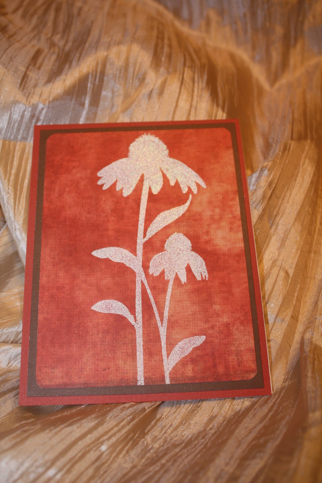
 One of the few non-Christmas cards I've done in a bit. I had the flowers left after another project, and coloured them with light purple ink. The sentiment is from Tim Holtz.
 I LOVE this stamp... it's probably my favourite one. It's from Stampin' Up. The actual stamp is quite a bit bigger, but I can pull different elements to create several possibilities. This one was coloured with Copics, and then rubbed over with tea stain distress ink.

 There's a bit of a theme with these cards- this one is also Stampin' Up. Lovely as a Tree has many possibilities. This one was stamped in rust ink and I used rust coloured card stock to frame it. The image is stamped on a light beige card.

This tree is really pretty- I punched the holes where there's a star on each branch, which allowed the shiny red background show through. The snowflakes were stamped on the background in a light grey.

I've been working on a photo album. I'll post pics of them soon...

Friday, November 26, 2010

Playing with alchohol...

inks, that is. 
It's been a while since I've played with the inks- I got this new stamp set last month, and it has so many possibilities. I've coloured it with the copic markers, but I really love how this turned out. 


Having the flower layered onto the smaller pieces of card first and then onto the background really makes it pop. I can't wait to play with this one some more.


Thursday, November 25, 2010

First craft sale

I did my first craft sale this past weekend (Nov. 21) at Crescentwood Community Centre. The weather was nice and snowy, which I think kept some people away- there was some steady traffic over the day, but the afternoon dropped off a bit. I am pleased with how the display turned out.


 The magnet board was recycled from an old shelf we had and my husband made the frame for it. I am pleased with how it turned out.


I love this stamp from Stampin' Up. I think it was a hit with most people, as well- I sold most of the mint tins.

 I'll have some more photos of some of my cards soon, as well as some other stuff I've been working on.

Cool!

I just heard about a blog that features items that are handmade in Manitoba- oddly enough, the blog is called Handmade in Manitoba. I wanted to check it out and see what kinds of cool crafts and crafters are featured on it... imagine my surprise when I came across this: my stuff was mentioned! The sale mentioned, Crescentwood, was the first sale I've done this year. It was fairly well attended, even with the snow, and it was a fun show. I've been busy with some creations, and I'll get them up soon.

Sunday, October 31, 2010

Christmas cards on Halloween night

So far this year, we're up to six trick or treaters- up two from last year. We've officially set a record. 
Still working on getting cards made for the craft sales.

 This one was done by running a copper sheet through my cuttlebug with a Christmas tree folder. Can't really see it in this photo, but the sentiment says Season's Greetings on the bottom right.

 I love snowglobes. This one was made by stamping the snowman and colouring him in with Copic markers. Then, I cut out a circle from a sheet of acetate. I cut a small piece of silver glitter paper for the base and attached this really cute ribbon. The acetate is held in place with the snowflake brads.

 This card is probably my favourite out of this set. The snowflakes (Stampin' Up) were stamped in white on navy cardstock. The circle and scalloped circle were cut out with the Cricut. I coloured the bead with Copic and attached the circles on top of the ribbon.
I bought the brad on this card in the States last summer. I really liked them and had no idea what I was going to do with them. It nicely filled the white space on this card. The flourish at the top is Stampin' Up's Baroque Motifs) which was stamped in red and then glammed up with red embossing powder. The stamp is from the $1.50 bin at Michael's.

That's it for now... thanks for looking.

Saturday, October 30, 2010

Little bits of paper and some glue

Over at Splitcoast Stamper this week, there was a  rummage and scavenging challenge. It's the first time I have played for a challenge, and am pretty pleased with how the cards turned out. I still have some Christmas paper to play with- that'll be tomorrow's fun, I think.
I realized I didn't have any baby or wedding cards for the upcoming craft sales. Not sure if I'll need them, but better to have them.


I love these cards. Gold, browns, whites and off-white. I rubbed some different shades of brown and sepia inks on some of the cards to give them a vintage look. I hope that they are a hit at the craft sales.

Tonight, I made Christmas tags- I bagged them in groups of 15, and let me tell you- there was a lot of holepunching, ribbon tying and cutting. I have ordered some Stampin Up tag stamps. I can't wait until they get here.

Wednesday, October 27, 2010

Last of the oldies

I wanted to get these cards uploaded before I get started on more- I have many ideas and I am running out of time before the craft show- about three weeks until the first one.


This idea is from my friend Mona. We took a trip to Stonewall to Scrapyard. I love that store, and when were were looking around, we came across the shiny red cardstock. It's lovely as a backdrop under with the snowflakes stamped onto acetate. So pretty and sparkly.


This is another of my Stampin' Up sets. I love the colour combination on this one- rusty reds and browns are really pretty together. 


This idea also came from Splitcoast Stampers- it's from Lovely as a Tree, which was stamped like pine boughs and glammed up with an ornament cut out on the Cricut in sparkly gold paper. Puts me in the Christmas mood, and with rumors of snow over the next couple of days, it's time to start thinking about the holiday season.

Tuesday, October 26, 2010

Time flies!

I cannot believe how fast the summer went.
I haven't been doing a lot of playing with paper, but I have had a few ideas, and I have been getting ready for a couple of craft sales I'll be doing over the next few weeks. 


Here's a small sample of some of the things I've gotten ready- the rest will be coming in the next two weeks or so. I hope to update my blog more often... that's the pipedream, anyway.

Thanks for looking. 


This is done on shimmery green cardstock with the trees stamped and embossed to make them look like they have snow on them. The stamp is Stampin' Up's Lovely as a Tree.


This card is very basic.  The sentiment inside is 'Congratulations'. It's made with designer paper, ribbon and sparkly brads. 


I love the way this one turned out. It's done with a Cuttlebug folder on white then I took different coloured inks and smooshed them all over the card to colour it. The sentiment says 'Chase your dreams you may catch one.'

The inspiration for this card came from Splitcoast Stampers- The card panels are cut from a lighter cardstock. The sentiment in the corner is Merry Christmas. It's so nice when the card in your head translates onto paper the way you wanted it to.


I borrowed this stamp from my good friend. I really love him. There are three small brads on the snowflake. The red cardstock is embossed with Cuttlebug folders. The red and white layered together make this card pop. 

Another card inspired by Splitcoast Stampers. The white of Santa's jacket is embossed paper. The sentiment inside says 'Dear Santa, I can explain."

This card is really elegant. I love the simplicity of it.

Obviously not a card, but I had to take a picture of my helper cat. He's a very good assistant.

The colour combination on this card is really pretty- the designer paper in the back is cool blues and burgundy. The snowflakes are a punch, with a little bit of bling for good measure. 
I really like these colours together- dark red, craft paper and white- so classic and elegant. Added a little bit of bling to dress it up.

Thursday, May 13, 2010

One week, 12 cards

My mother in law is here for a visit. I decided that I needed to make her a set of cards. Husband said I should make 12. I was plugging along fairly well, until I ran out of ideas, then I decided to make Christmas cards.
Here are the non-Christmas cards that I made.

The diamond pattern came from a treasure bag I bought at a sale (misc packs were $2... who can pass that up??). The green is a Martha Stewart shade, and the pink is a scrap piece I had in my stash. I used my Fiskars punch to dress it up a bit, and tied in the black with a piece of ribbon.


I am loving brown and blue lately. I bought this stamp from Scrappin' Great Deals and embossed it with clear powder. The striped paper is from a paper sample pack, and the ribbon is American Crafts. The oval was cut with my Nesties and the brown was embossed with my cuttlebug.


I love the simplicity of this card. The yellow is from my score at the local scrapbooking store. I embossed the white with my cuttlebug and the sentiment is overlaid on pieces cut with my nesties.


Once again.... Tim Holtz, how I love thee! I used some Martha Stewart CS for the background and then distressed the white cardstock. I stamped the sentiments and the vehicle with brown ink.


This cuttlebug folder is probably my favourite (for now, at least). Orange isn't a colour I usually use, but I liked the way it looks with the ribbon.


We were at Costco with my mother in law, and there was a set of Royal Daulton china. There was a pattern that had white dots on a blue background, and I was inspired by that cup. I embossed the blue with Swiss Dots and then rubbed white ink over the card. The sentiment is embossed with white.


Pretty basic- layered card, American Craft ribbon and the happy birthday embossing folder.


Friday, May 7, 2010

Oh Distress Ink... how I love thee!

I have been playing with the Tim Holtz Distress Inks I won from an EBay auction (and the one I bought from Michael's... shhh... don't tell my husband! ;))
I have to say, I really love the way they look on paper and the creativity and unique qualities they give to cards. I have been creating a range of things this week... cards, bookmarks and easle cards.
Here are three cards that I have created.


This card was created by putting Brick Red distress ink on a piece of glass and pressing the white cardstock into it. Then, I took the wet paper and crumpled it up, taking care when uncrumpling. Then, I took Weathered Wood distress ink and brushed it across the creases. I dried with a heat tool then ironed the paper so it was flat. I then took the scalloped nestabilities and cut out the shape, adhered it to the black cardstock and added the red paper roses, which I purchased from the dollar store.

This card was stamped with the flower using versamark, then I embossed it with clear embossing powder. I put the distress ink on glass and then pressed the white card into it again. The resist technique worked particularly well with this stamp. I then added the vellum on top, attaching it with the brads. The sentiment is from Tim Holtz.


This one is probably my favourite... for now. I used the Broken China, Brick Red and Marmalade distress inks on glass, then crumpled the paper again. When it dried, I stamped the flowers onto the card and embossed with white. The dragonfly is embossed with blue, and the sentiment is stamped with black ink.

Tuesday, May 4, 2010

Mothers' Day mayhem

I wanted to do two Mothers' Day cards this year- one for my mom and one for my mother in law. I had a very specific idea for the card I wanted to do for my mother in law, and it involved playing with some new stuff that finally arrived from an EBay auction I won.
Included in the auction from EBay was some crackle paint. I wasn't sure about it, and I have decided that I do like it, but it takes a little play time to get it right. If you put it on too thick, it tends to make the paper curve.

This card was done with brown cardstock. I painted the pink crackle paint over the cardstock, let it dry and then attached it to a white background. The brown cardstock frame was embossed with the cuttlebug and then the opening was made using the nestabilities. The flower was one that I got from the dollar store and took and the brad was part of a set purchased at the dollar store. The colour didn't match anything, so I painted it with crackle paint. The ribbon was found at Michael's. 


 This is the card that I did for my mom. I love black and white. It's so clean and classic.
The black cardstock is punched out then the patterned black paper is layered on top of a piece of white which was embossed with the cuttlebug. The butterfly stamp was embossed with silver, and the flower which was purchased at the dollar store adds a little bit of colour.

Monday, April 26, 2010

Lessons learned

This week was rather educational, and quite trying. On our way home from Ontario, I bought a few new toys I wanted to play with. I had a great idea for a card/bookmark combo. Let's just say that the idea I had in my head was way better than the one that I ended up with.
I wanted to make an acetate card with some new watercolour paints I picked up. I learned that watercolours will NOT dry on acetate.
I also learned that:
Bounce sheets will take the static away from acetate.
If left under the acetate while heat embossing, Bounce will melt.
It's not a great idea to heat embossing a second time (it will melt the second colour, but it can also remelt the first colour).
This is the card I ended up making. Not sure what it's going to be used for yet, but I really like the way it turned out.
To make it, I stamped the flower image on vellum and then heat embossed. Coloured with watercolour pens. The word background is a new Tim Holtz stamp I got, which I stamped with Staz-on while masking the flowers. Then, I attached the vellum to the inside of the card. On the inside of the acetate, I cut another small piece of vellum and attached it. I added a punched flower for a little pizzaz on the inside.


Once I finish my Mothers' Day cards, I'll post them.

Monday, April 12, 2010

Life

Life has been a little busy the last little while. My father in law passed away on April 3. My husband was visiting them, and had to catch a flight home on Saturday. He was on the ground for about 20 minutes when we got the call that Art passed away. We headed back to Ontario on Monday, and have been dealing with things for his mom since we've been here.
While my husband was in Ontario, I created some cards for his mom to give out when the time came. I am really pleased with how they turned out. The design is fairly basic, but it took me some time to figure out what I want to do. The card with the anchor on it is for the years he spent in the Canadian Navy. I downloaded the image from the Internet and cut it out. The layered cardstock gives it a little more dimension, and the embossing adds a little more flair.

It's been a very busy week for us, especially husband. I am looking forward to the trip home. We'll be taking it slowly, and will be doing some shopping (IKEA and Hobby Lobby, here I come!)

This is my favourite picture of my father in law. He had no idea I took it until I showed it to him after. It was taken at a surprise party for their 50th anniversary last summer. RIP Art. It was my honour to have you as my father in law. You will be missed.

Friday, March 26, 2010

Alcohol ink

Sometimes, when you're staring at a table full of supplies and have no idea where to start, inspiration hits. That was me tonight.
I wanted to create something... anything. I just didn't know what. Then I saw the alcohol inks. I love the way the colours change the more you play with them, but I didn't want to use gloss paper or transparencies tonight. Then, I saw the vellum. I bought a new stamp last weekend that I love, and bought the vellum to make the card that was on display at the store. I started to experiment and see what alcohol inks would look like on the vellum. I am glad that I experimented. This is something I can see myself doing for my Christmas cards this year. I really love the way it turned out.

This was the first attempt. I really like the way it turned out. The alcohol ink was put on the vellum. I played with it, adding and removing colour, I used three shades of blue (denim, cloud and I can't recall the third one) plus some silver metalic. In between colour layers, I used my heat gun to set the colours. I used staz-on for the trees (Stampin Up's Lovely as a Tree stamp). Then I used my Nestabilities to cut the mat out of metalic light blue paper. 

 
This was the second attempt. I am not as fond of this one- I think I needed to play with the colours a little more. The technique was the same. 
Now, just to find something to use them for!

Tuesday, March 23, 2010

Simplicity

I wanted to create a card that was very simple and clean. What I ended up with wasn't quite what I had in mind, but I really like the way it turned out. I had the card designed with black, silver and white, but it needed a little something extra, and I think this pop of red really adds something to it.
Layers are as follows (starting at the bottom layer):
White cardstock
Black cardstock with punched edge
Silver cardstock
White cardstock embossed with a Cuttlebug folder
Black ribbon
Red cardstock cut with a Nestabilities.
Silver dragonfly brads.
White cardstock cut with the next size up.
Sentiment was done on the computer and printed.